Project Overview
Project type: New platform and problem space
My role: Product designer
Product type: B2B SaaS Web application
Industry: Human Resources
Tools: Figma, Figjam, Notion.
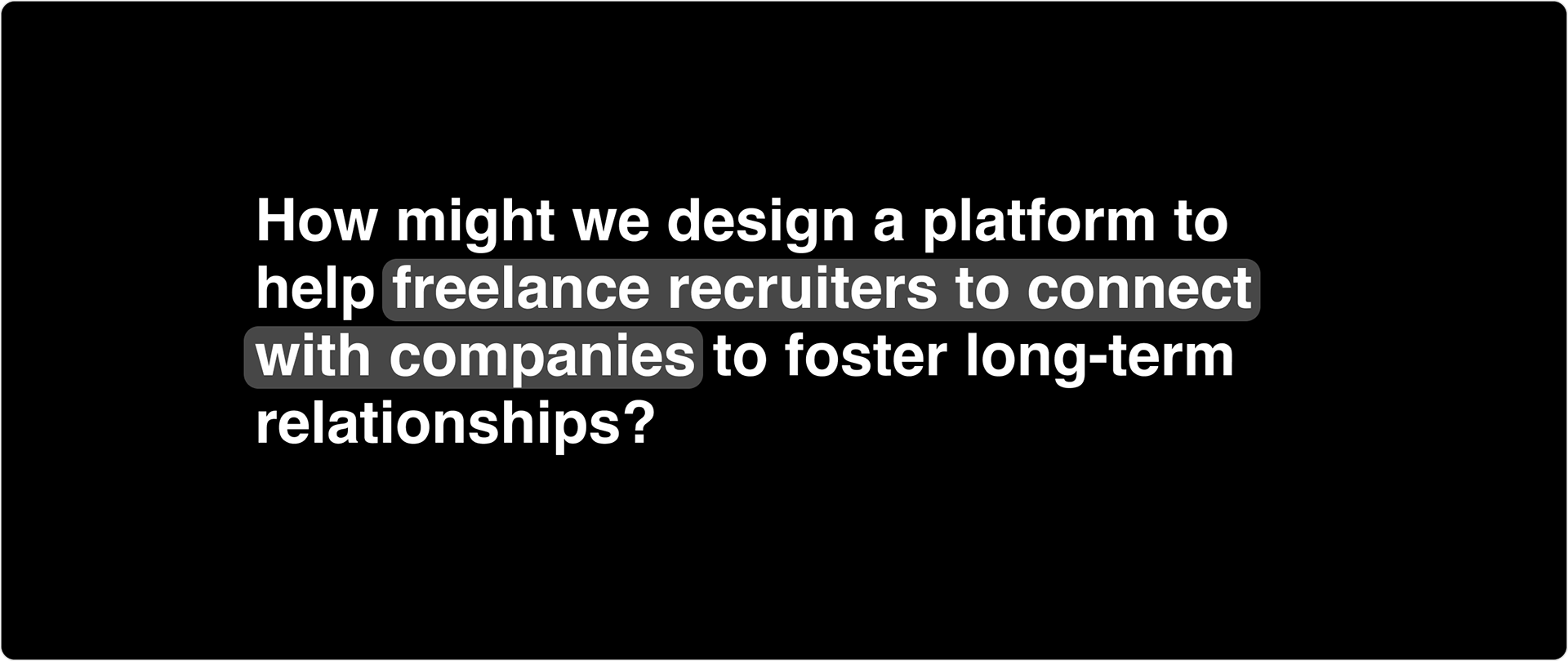
Project Goal
Create a platform connecting freelance recruiters with companies to facilitate successful job placements and streamline business relationship management.
Approach
I developed a seamless prototype to demonstrate the platform's core functionality for MVP release. The prototype was designed to showcase key features and user flows to potential investors, building on existing interest from recruiters and employers who had already expressed commitment to using the platform.
Results
Delivered a functional prototype that effectively communicated the platform's value proposition and capabilities. The prototype served as a crucial tool for securing funding to scale the platform, leveraging the foundation of pre-existing user interest from both recruiters and employers.
The working group:

About Networker
Networker was founded by two experienced recruiters who identified the need to simplify business development and streamline processes for freelance recruiters and companies.
What was the problem space?
For Recruiters
Recruiters often use multiple platforms to manage their workflows, leading to inefficiencies when consolidating data. Some examples include:
• Managing candidate details.
• Handling employer communications.
• Tracking application progress.
• Managing payments.
For Employers
Companies want to find talent quickly and use reliable recruitment processes. They also seek to:
• Identify talent within tight deadlines.
• Work with recruiters who understand their company culture and hiring needs.
• Define effective sourcing strategies.
The Design Process
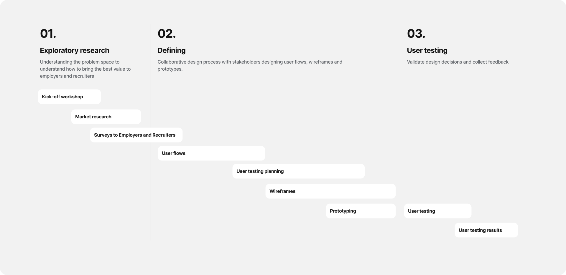
Part 01.
Exploratory research
Understanding the problem space to bring the best value to employers and recruiters.
Leadership | Strategy | Data Analysis | Collaboration | Stakeholder management
Kick-off workshop
The goal was to clearly understand the product's vision and the founders' objectives and do it collaboratively. I wanted to ensure everyone was aligned on where the project stood and the efforts required to launch an MVP, as well as understanding what was important as a designer, as an engineer, and for business stakeholders.

Kick-off workshop snapshot
My role
Planned and facilitated the workshop
Outcome
• The definition of the MVP features based on resources, budget and time.
• Defined the ways of working and cadence.
• Agreed on having a centralised database to add updates, feedback and documentation.
Market research
I started by conducting market research and learning more about the industry so I could understand how other platforms tackle similar problems.
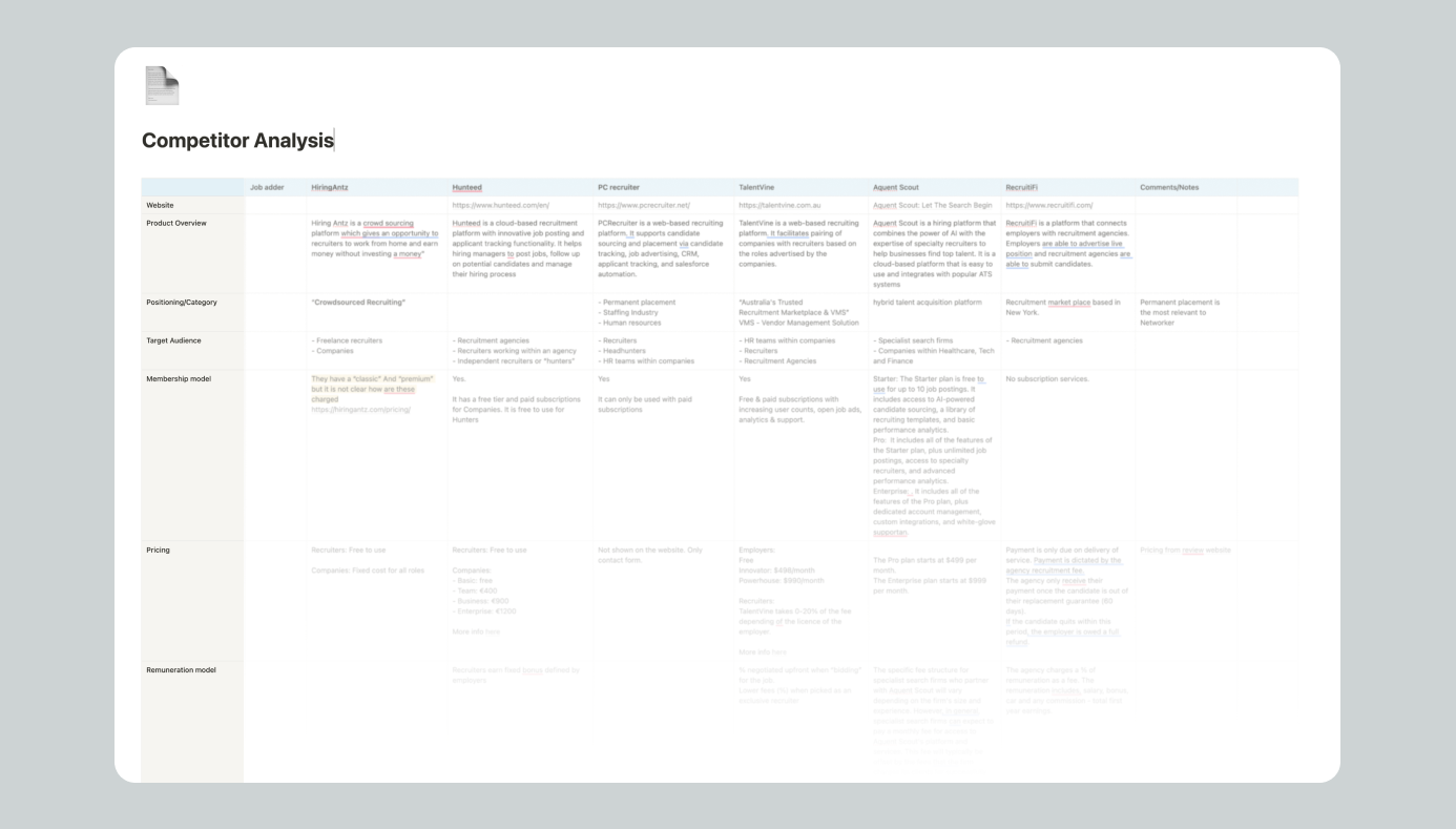
Approach
Analysed platforms that solved similar pain points, as well as marketplace platforms. I analysed the product features, user flows brand and marketing tone of voice, and product reviews to identify potential opportunities.
Outcome
A competitor analysis report with companies that solve similar customer pain points.
Surveys to Employers and Recruiters
Then, in collaboration with the Product Manager, we formulated the questions and sent a survey to potential customers
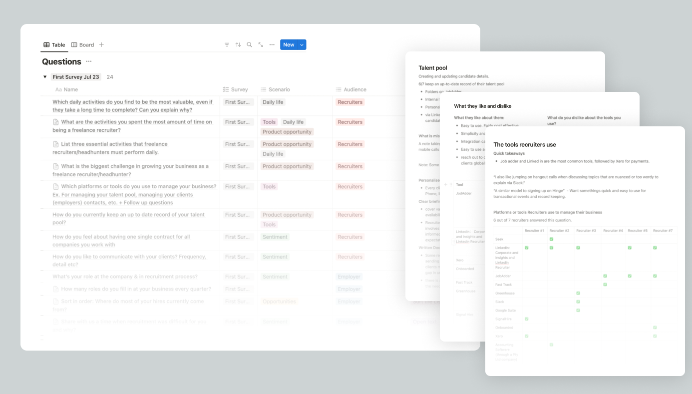
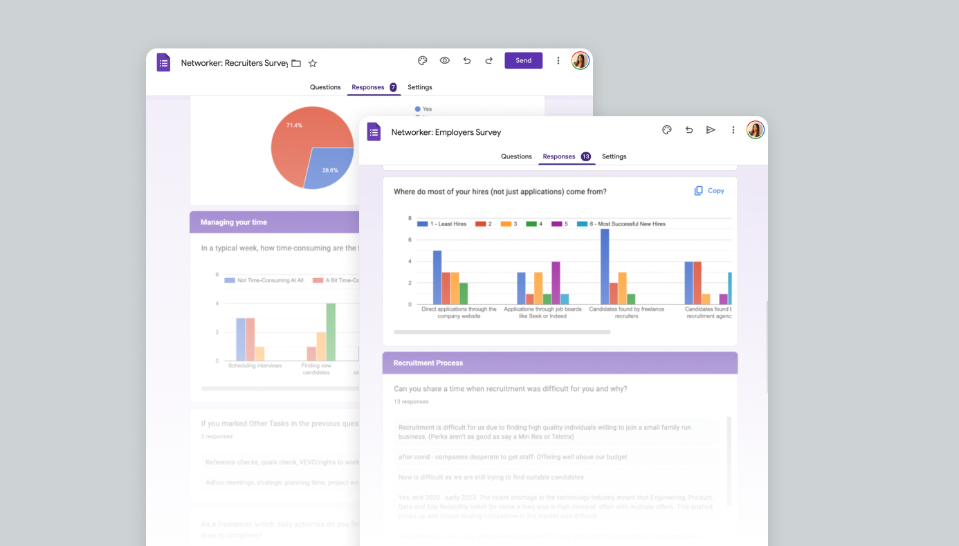
Approach
Conducted a survey with potential users, including recruiters and employers who have been interested in being beta users. The questions included analising which tools they currently use to understand their preferences, and pain points, identifying opportunities for improvement and innovation.
Insights
• From employers, we observed a strong interest in working with freelance recruiters instead of traditional agencies, provided that the results were guaranteed. We also identified their motivations and behaviors in how they currently approach talent acquisition.
• From recruiters, we identified the most time-consuming tasks and those that provided the most value, helping us understand areas for improvement.
Outcome
Validated the concept and features that would impact users' workflow. From here, we defined the MLP and MVP with evidence-backed insights, prioritising essential tools for easier adoption.
MVP definition
For the first release, the MVP features included:
• Job creation: Employers could create job postings, allowing recruiters to submit candidates.
• Messaging System A built-in communication tool enabled seamless interaction between employers and recruiters directly within the platform.
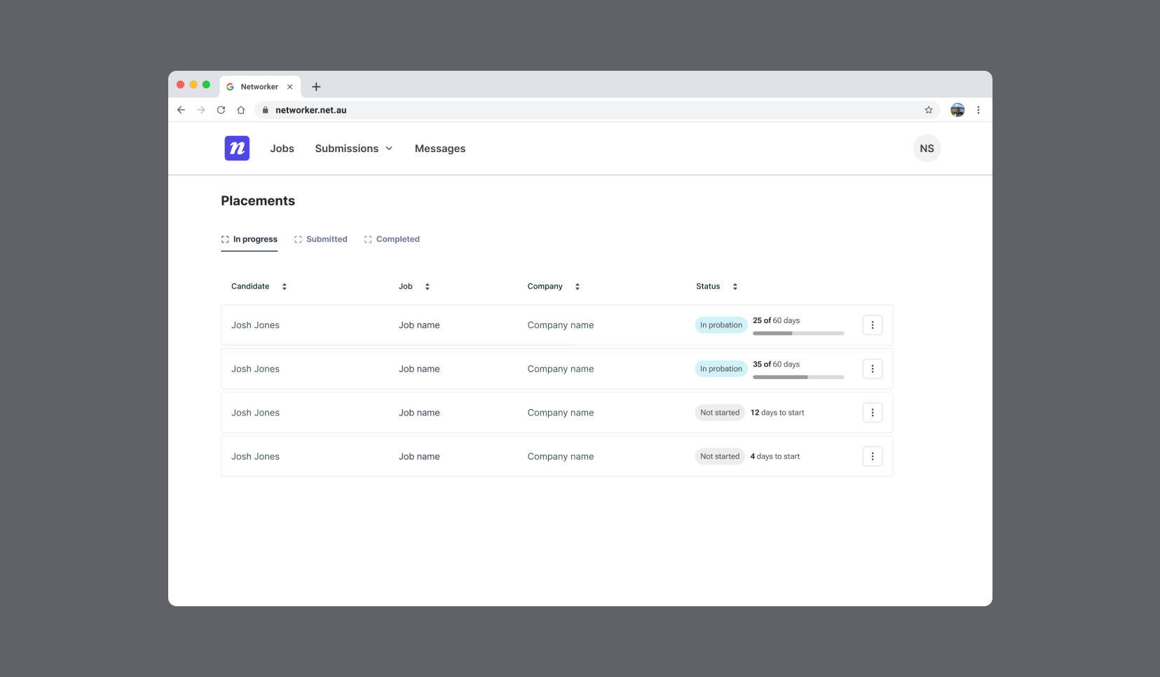
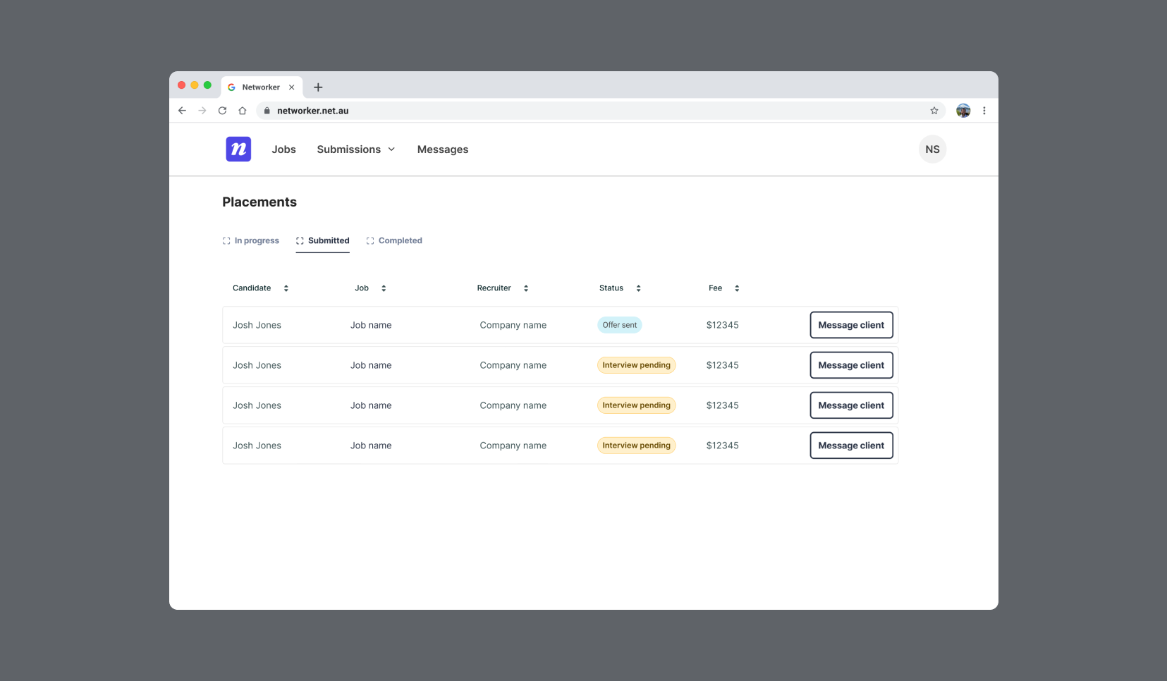
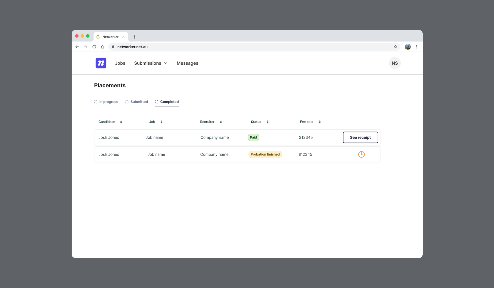
• Applicant tracking: Users were able to monitor the progress of candidates throughout the hiring process.
Part 02.
Defining
Collaboration with stakeholders designing user flows, wireframes and prototypes
Strategy | Collaboration | Visual Design | UX Design | Design Systems | Leadership
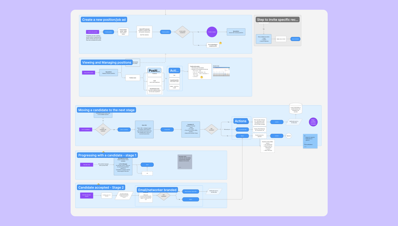
User flows and wireframes
The wireframes served as a blueprint to oversee functionality, technical capabilities and key interactions and refining the user experience. mid-fidelity wireframes to test key interactions. I worked closely with the stakeholders to make sure we were aligned in customer the experience and the business goals.
Design and interaction explorations
Search interaction: Top bar and sidebar navigation
Search explorations: Top bar and full-screen search results
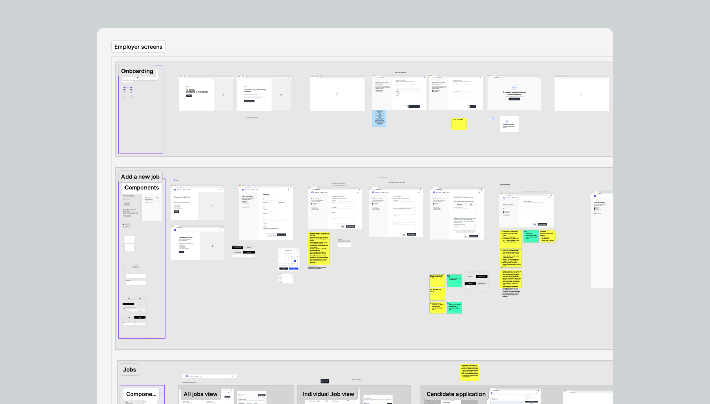
Final MVP prototype
Developed a clickable prototype in Figma for usability testing. Iterated based on stakeholder feedback, prioritising clarity and accessibility.
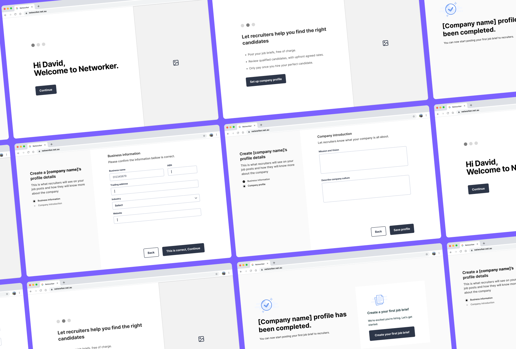
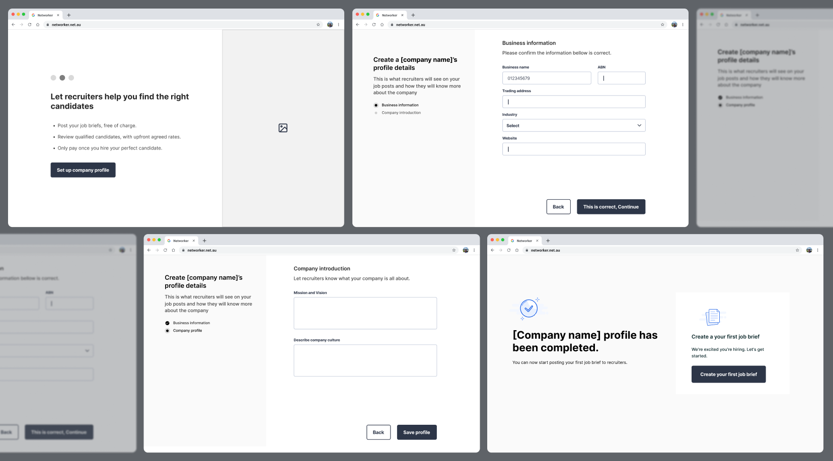
Onboarding
• Users understand how the platforms work at a glance
• Both user groups can set up their profile and business information
• Employers to create their first job brief (optional)

Job creation
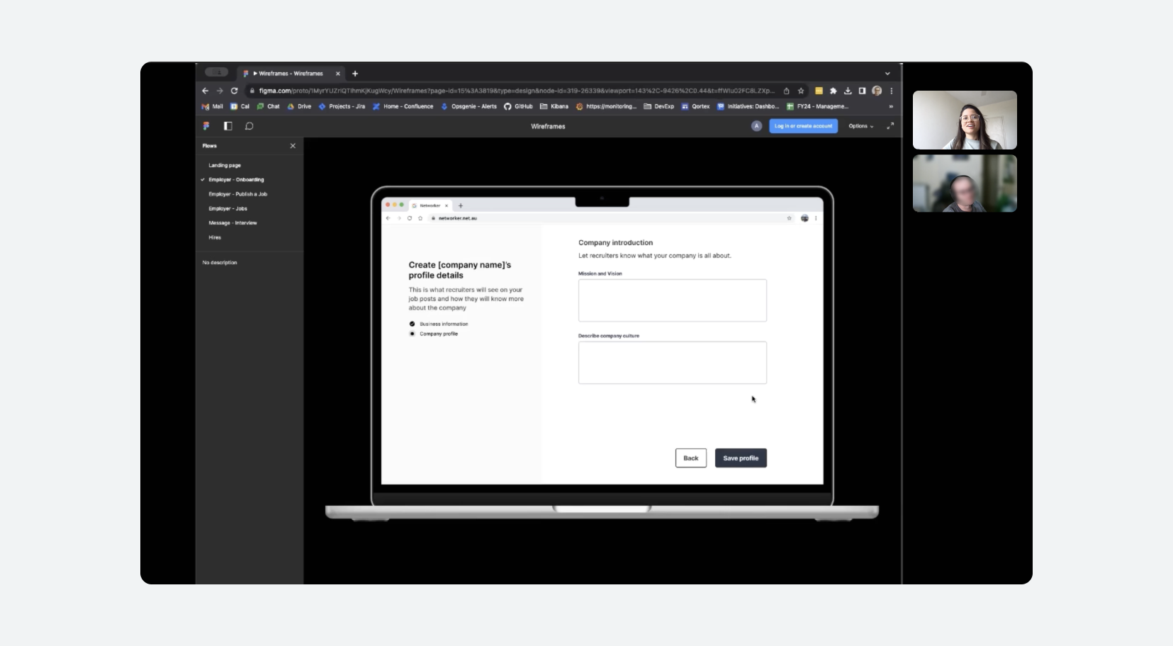
The objective was to "Mimic" the usual phone conversation that happens between a recruiter and an employer while explaining a job brief as well as specifying terms and conditions for both Employers and Recruiters.
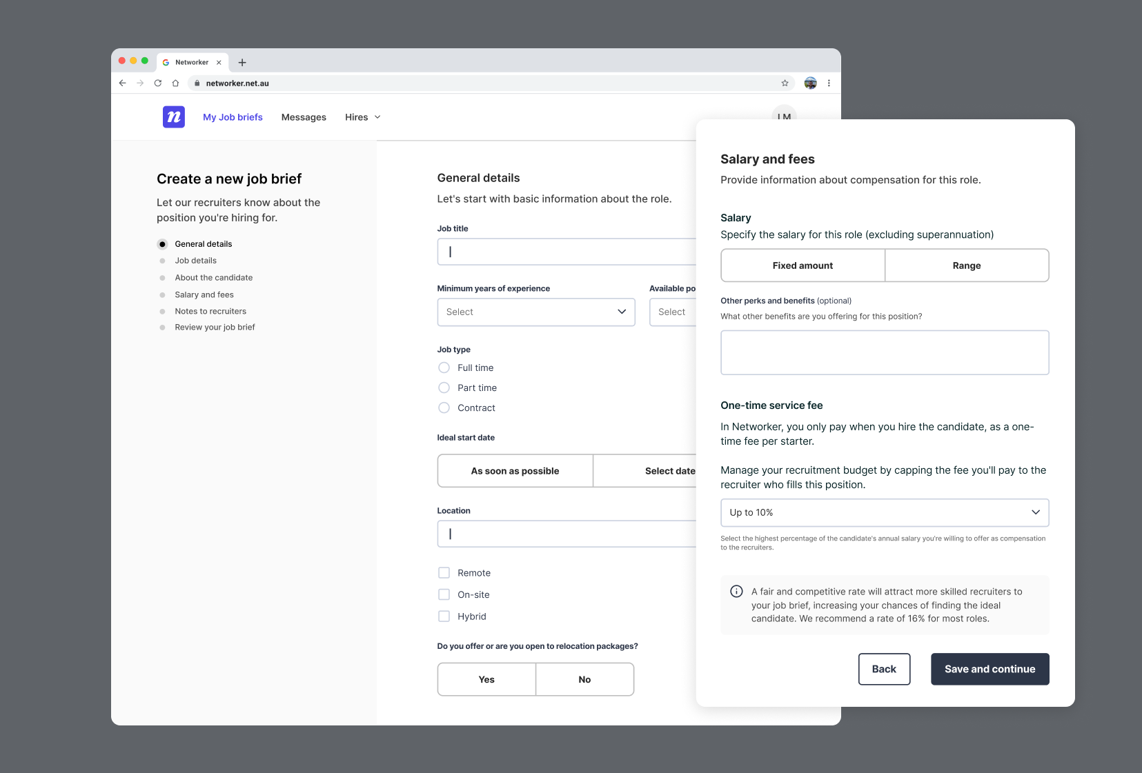
Snapshot of how companies would create a job brief for recruiters.
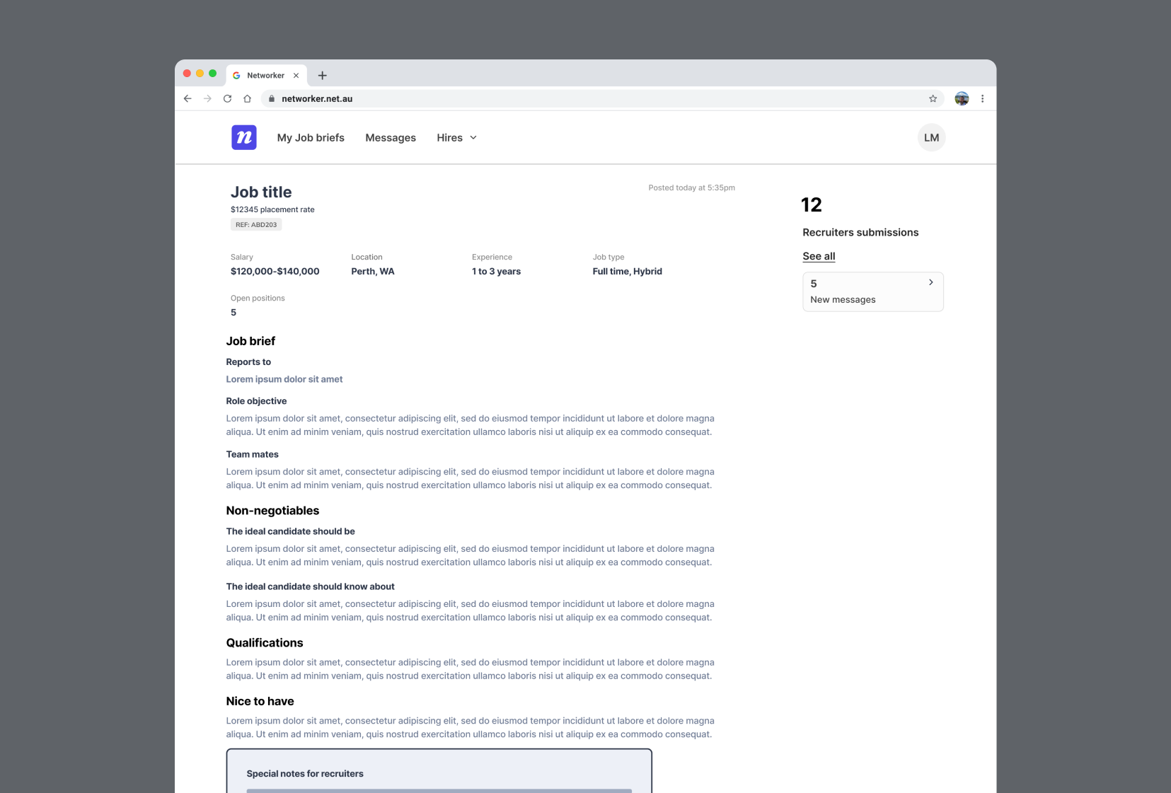
Job post
Messaging system
The purpose of this feature is to facilitate clear and efficient communication to reduce reliance on external tools, and to keep all job-related conversations in one place.
The challenging part of designing this was dealing with multiple job postings, each with submissions from different recruiters. And since each recruiter could submit up to two candidates per job, it could quickly get complicated
To make it simply, I:
• Grouped chats by each job posting
• Showed a clear status for each application
• Displayed the number and names of candidates submitted by each recruiter
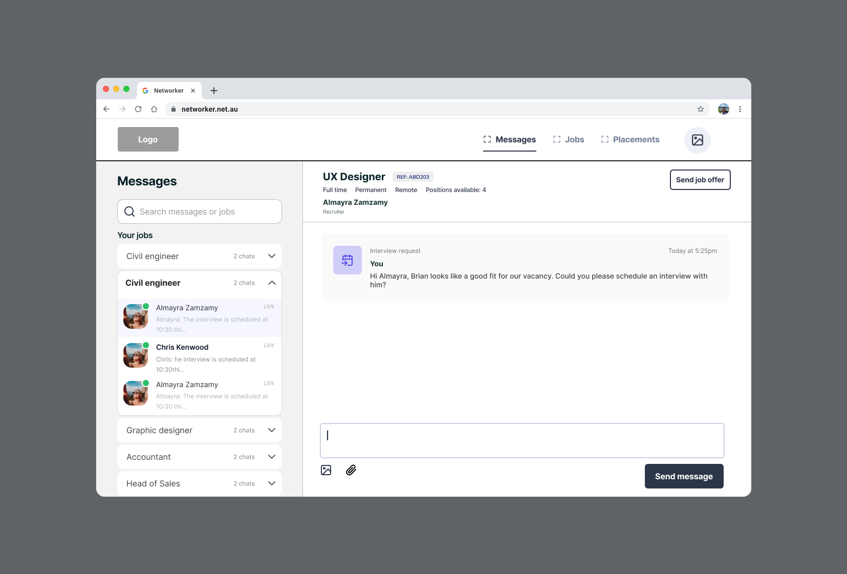
Messaging for Employers V.1.
Part 03.
User testing
Validate design decisions for the first release
Strategy | Collaboration | Visual Design | UX Design | User testing facilitation
Defining success
After planning and facilitating user testing to validate designs, copy and overall understanding of the product, we defined that the designs were considered successful if on each user flow the users understood the following:
• Onboarding: The employer understands the business terms
• Creating a job: The user understands when the job is live
• Messaging: The user understands where to find communications with recruiters about specific job vacancies
Feedback and insights
The feedback we received confirmed the demand for the product, validating that we were on the right track while also identifying areas for improvement. This allowed me to pinpoint actionable changes within the user flow:
• Adopting a conversational tone is valuable for users: Users valued the job brief feature for replacing traditional phone calls and including key details recruiters need to find the right candidate.
• Making the experience realistic helps build trust: Hiring managers appreciate the "Non-Negotiable" field, which helps them to build more aligned teams.
• Providing more context to avoid confusion: Some questions in the flow were unclear, and users requested additional context or explanations to understand better the purpose behind certain questions.
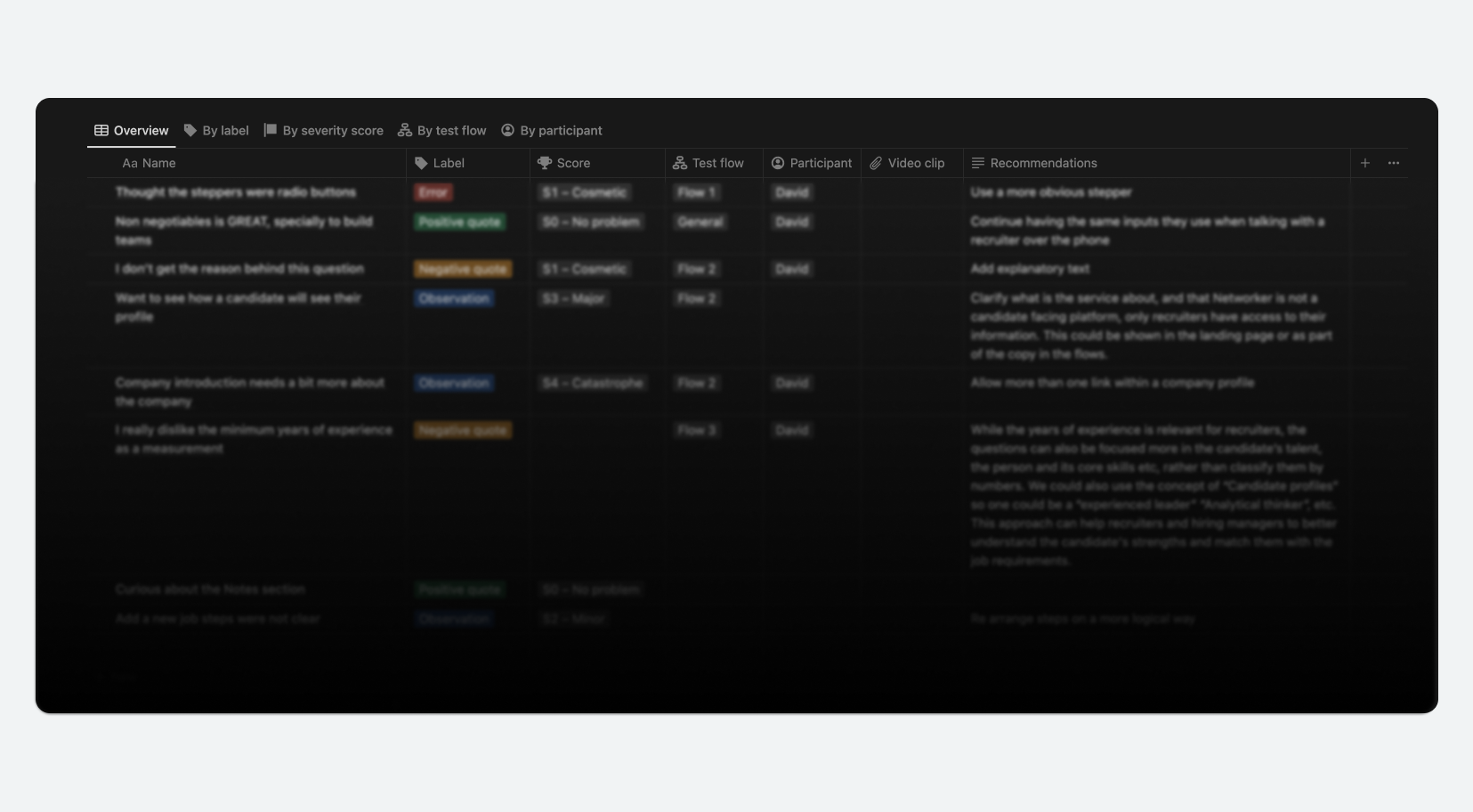
User testing report snapshot
Project outcome
The clarity of the insights and prototypes helped secure stakeholder alignment with the proposed roadmap for the first release.
Delivering tangible aolutions for Employers and Recruiters
The platform addresses key challenges for both employers and recruiters by reducing time-consuming administrative tasks and streamlining business development.
• For employers: It connects them with recruiters who understand their needs, culture, and hiring goals, offering flexibility in contract management.
• For recruiters: It consolidates data management and business tasks within a single platform, saving time and boosting productivity.
This alignment not only solves immediate pain points but positions the platform as a valuable solution in the market, contributing to the platform’s success in solving a real problem.
My takeaways
There isn’t a linear and set process
Design frameworks are designed to help the design process and results, but each project is still unique.
Limited resources accelerate learnings and growth
Some resources were not available during every stage of the project, but this motivated me to investigate and learn more about backend data management and content writing.
Building trust to work faster and more efficiently
As the first designer on the Credit card crew, I had to understand the processes first to start building a collaborative dynamic.
What would have I done differently?
I would have prioritised conducting more interviews over surveys to ask deeper questions and better understand the responses, and I would have performed user testing with recruiters unfamiliar with the project to mitigate potential biases from the founders.